Architectural
5 Design Improvements to Increase Stair Use
Because stairs are already present in almost every building and readily used without presenting any major lifestyle changes, stairs have a real potential, among all building elements, for effective, accessible, and economical health impacts. But simply having stairs isn’t enough. If you want people to take the stairs, make them usable.

Increased stair use is one of the key ways workplaces can incorporate physical activity into their employees’ daily routines and combat the rise of chronic health conditions like obesity, heart diseases, diabetes, and even mental health issues. And the benefits aren’t limited to just physical health – increased stair usage in the workplace also promotes sustainability, encourages collaboration, and has even been shown to spark innovation and increase productivity.
Because stairs are already present in almost every building and readily used without presenting any major lifestyle changes, stairs have a real potential, among all building elements, for effective, accessible, and economical health impacts. But simply having stairs isn’t enough.
In order for stairs to make a difference of any kind to building occupants, they have to used, begging the question – how can design be used to encourage stair use?
The answer lies in incorporating universal design strategies to create stairs that are safer, more comfortable, and more accessible, encouraging their use.
Good design encourages stair use
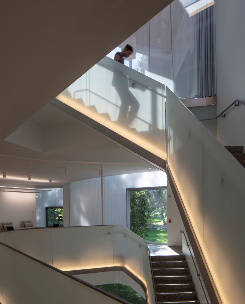
The design of stairs can either promote or deter activity through their availability, convenience, desirability, safety, and comfort. According to the Center for Active Design’s “Active Design Guidelines”, measures for increasing stair use include: providing stairs for everyday use, actively encouraging stair use, and designing visible, safe, appealing, and comfortable stairs. Similarly, prominently featuring and giving people access to stairs is a key aspect of WELL Building Standards, encouraging occupants to move about, socialize, and stay fit. WELL Fitness Feature 64, for example, recognizes designs that encourage workers to be active indoors with “accessible, safe, and visually appealing stairs, entryways, and corridors.”
Unfortunately, stairways have become a source of fear, discomfort, avoidance behavior, and even accidents among building occupants due to design practices that have outweighed aesthetic appeal over comfortable and safe usage. Not governed by the codes for the required means of egress, monumental stairs often have design features (such as open risers and inadequate handrails) that are considered uncomfortable and even hazardous by many stair users. A recent survey of issues experienced when navigating public buildings found that using stairways was the top problematic activity, making stairway design a high priority for end users in public buildings.
If you want people to take the stairs, make them usable
What is Universal Design?
By designing not only to meet the needs but also to improve the experience of all people who wish to use any element of the built environment, universal design (sometimes referred to as inclusive design or inclusivity) provides benefits for all users. Universal design doesn’t mean making one solution for all people. It means considering and including people with a broad range of perspectives in the design process. To inspire the best possible design, it’s important to examine the experiences of people navigating surface level changes and understand the challenges or discomforts they face, what tools they use, and what strategies they employ to negotiate this important aspect of mobility.
How a space is designed can raise or lower obstacles to the participation of our society within it. Everyone experiences a space differently; a design process that starts with seeing the diverse and wide range of human abilities and perspectives as a resource for better designs lowers these barriers through the creation of inclusive and universally accessible environments. By designing to meet the needs of all people who wish to use any element of the built environment, universal design reduces stigma and provides benefits for all users. This not only opens the built environment for broad use, but it also reflects how people really are, creating an environment in which the most people can participate and experience a sense of belonging.
Improving the Experience Broadens Usability
While ADA regulations consider the accessibility of the built environment for people with impaired mobility, ensuring alternate pathways for those who cannot use the stairs, they do nothing to improve the experience for those who can. The physical ability to navigate stairs doesn’t mean the individuals who do so experience stairs in the same way or to the same degree of comfort and safety. Consider, for example, how navigating stairs might be experienced by blind, low-vision, or deaf people. Or consider how a glass stair might create discomfort for those attired in skirts or dresses, deterring stair use. While such individuals all can and do navigate stairs, each does so with concerns unique to his or her individual perspectives. Universal design advocates taking these many perspectives into account to collectively inform the design.
Five commonly seen problematic stair elements that can be improved by universal design strategies to encourage stair use:
1. Floating Stairs and Open Guardrails
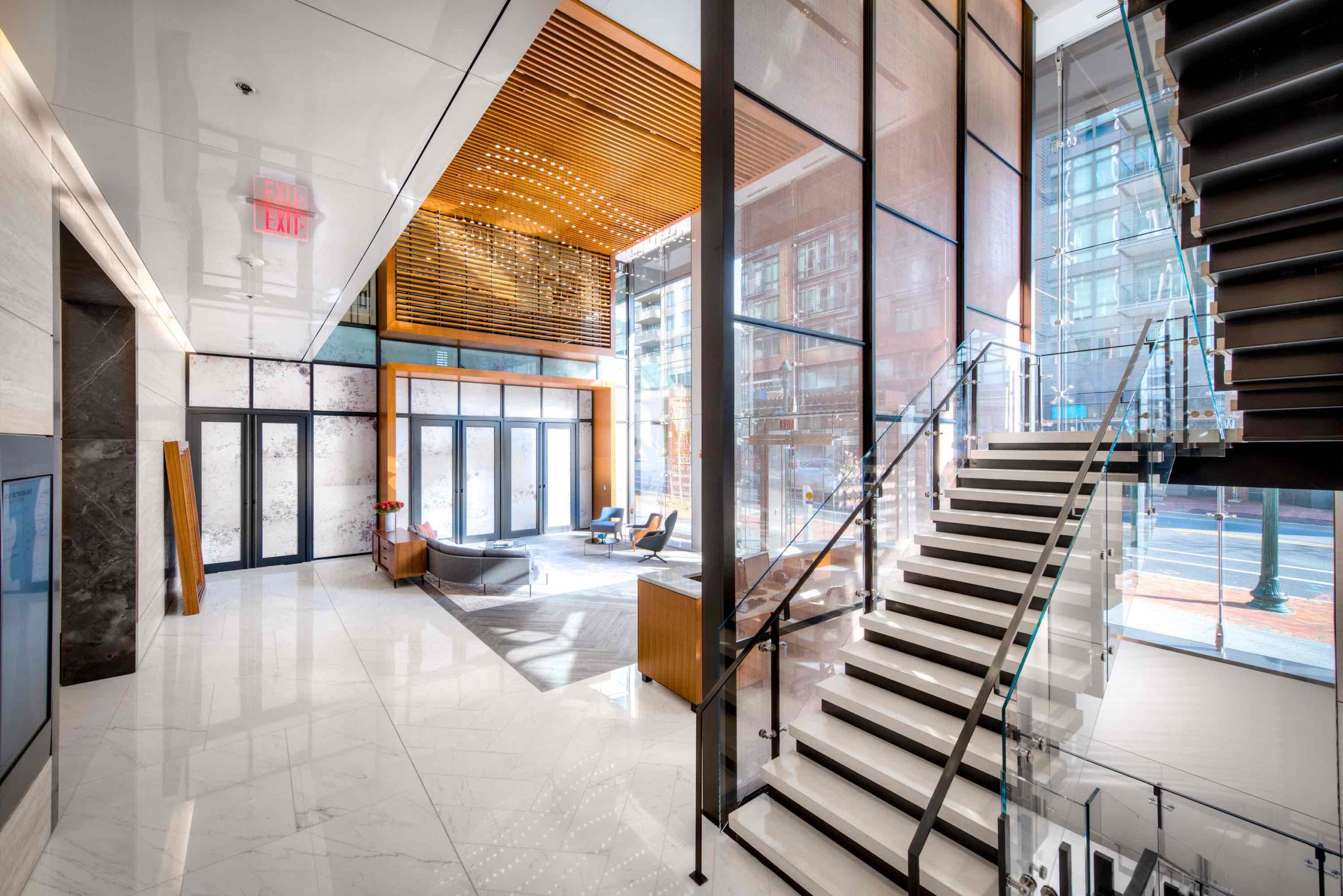
Floating stair designs with glass treads, glass guardrails, and open risers are increasingly used by designers to allow spaces to maintain an open feeling with ample natural light. While the modern look is very popular, open risers and glass guardrails can be visually confusing or have a strobing effect, which can lead to tripping. They can also create immodest sightlines for passersby. Instead, it’s recommended that all risers be in-filled. The solid barriers between treads block distracting views in the background and prevent light seeping through from behind the stairs that may draw attention away from the steps. Closed risers prevent feet and canes from accidentally slipping under treads, and they keep objects on stairs from falling through. For guardrail solutions that protect privacy, read our article on stair modesty.

Synergi’s stairs at 4747 Bethesda Avenue in Washington DC provide high-contrasting black risers and white treads, making each stair easy to detect.
2. Color Palettes That Are Too Uniform or Too Complex
Stairs with risers and treads in different colors, especially high contrast colors, make it easier to detect the stair edge when walking upstairs. The color of stair treads should contrast with walls and flooring to alert passers-by, especially those who are visually impaired, to the presence of steps. Multi-colored, abstract, or confusing floor coverings should also be avoided, as these can be disconcerting to the eye or impair one’s sense of depth perception.
3. Projecting Stair Edges (Nosing)
Some stairs have treads that project or hang over the risers beneath them. This overhang is a stair’s nosing or lip. Nosings that overhang stair treads can cause tripping, particularly when ascending. Consider people who ascend steps by sliding their feet up the surface of the riser or rely on the of use visual aids, such as canes, to feel the stair. It is recommended that risers be vertical, not angled. This prevents the stair edges from hanging over the risers beneath them, creating a projected stair edge.
4. Contrast Stripes Placed Near (Not On) Stair Edges
Contrasting materials on a step’s edge can provide a very effective visual safety trigger, particularly for people with low vision. Contrast stripes help outline each stair, which is especially helpful when descending (pictured below, left). While already in common use, it’s important to consider the placement and style of contrast stripes for them to be useful. Stair edges are often outlined with dotted contrast “stripes”, multiple stripes (pictured below, center), or with incontiguous stripes (pictured below, right), leaving room at the far edges of each stair. Contrast stripes should run continuously along the edge of the stair, extending the full width of the step.
Stripes should also be placed directly on the edge of the stair, not allowing for any noticeable gap between the stripe and the edge. Stripes placed away from the edge (pictured below, center) mislead those who rely upon their use. It is recommended that single contrast stripes with a minimum width of 2 inches and a maximum width of 4 inches be used.
Click on the below images to expand.
5. Using The Same Contrast Stripes on Every Stair
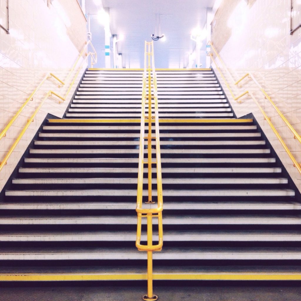
By using contrast stripes to mark each step, stair users subconsciously begin to associate each stripe with a step when navigating stairs – including the contrast stripe often placed on the last “step”, which is actually the edge of the landing. This last contrast stripe on the landing is often a source of confusion that can cause tripping. Contrast stripes on the top and bottom landings should be clearly differentiated from the other steps to warn of an approaching stairway or landing.

This staircase in a London subway station uses yellow contrast stripes to indicate the top and bottom of each landing and white contrast stripes to outline each step in between. A further inclusive measure, a second handrail at a lower height is present throughout, especially useful for children.
Universal design practices provide a strategy to improve stair visibility, accessibility, safety, and usability, improving the experience they provide and encouraging their use by the greatest number of people, creating a more inclusive and collaborative workplace. At Synergi, it is our hope that, with education and awareness, architects and designers will take interest in creating stairways that people are encouraged to use.

Rediscovering Monumental Stairs in Commercial Design
